

Ctrl-Alt-Health, Page 5 of 7
Reboot your digital practice
Welcome to Ctrl-Alt-Health, the Contensive blog where healthcare meets digital innovation. We help medical practices take control, reset what’s not working, and optimize their online presence to attract and retain more patients. From website design and SEO to patient experience and automation, Ctrl Alt Health delivers practical insights for running a healthy, high-performing digital practice.
Online Reviews or Website Quality: What Matters More to New Patients?
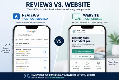
The decision framework doctors need when marketing attention has to pick one.
Practice owners ask us a version of the same question every week: “Should I focus on my Google reviews first, or fix my website?” It is a fair question. Both cost money. Both cost attention. And in a normal quarter, a practice can only meaningfully improve one at a time.
The right answer is less satisfying than most people want, and more actionable than most people expect. Reviews and websites do different jobs in a new patient’s decision. Which job is broken at your practice — not which asset is in worse shape — tells you where to start.
Reviews and websites do different jobs
Online reviews are a credibility filter. They are what a prospective patient uses to decide whether you are worth considering at all. A potential new patient searching for a dermatologist in your town will see four or five practices in the local pack. She scans the review counts and star ratings in about three seconds. Practices below a certain threshold fall out of consideration before she ever clicks anything. The purpose of your reviews, at that moment, is to make the short list.
Your website is a conversion tool. Once a patient has clicked through, the website is what decides whether she calls, books, fills out a form — or leaves without acting. It answers the three questions any mobile patient has in the first ten seconds: Is this the right place for what I need? Can I trust this practice? How do I take the next step? A practice with excellent reviews and a broken website gets considered, then lost.
Each of those jobs has to be done well enough. Not perfectly. Well enough. And the way you tell which job is doing the most damage is almost always a five-minute look at public data and your own analytics.
The threshold that actually matters for reviews
The most useful piece of research we can point practice owners toward is this: once you have roughly 20 or more Google reviews at a 4.0+ average, additional reviews provide diminishing returns for trust. Patients do not meaningfully update their opinion of a practice based on the 80th review versus the 40th. What moves the needle is (a) clearing that initial credibility threshold and (b) recency — both patients and modern search algorithms weigh recent reviews much more heavily than old ones.
This has two concrete implications. First, if your practice is below the 20-review, 4.0-star threshold — or has not received a new review in twelve months — fix reviews first. It is the fastest and cheapest fix, usually executed with a single polite workflow change at checkout or with an automated post-visit text. Second, once you are above the threshold and receiving a new review every month or two, additional review-acquisition effort is usually not where the next dollar of marketing attention goes.
Where are your new patients getting stuck — review filter or website conversion?
Our free medical website audit includes a read on your current review position — volume, recency, and competitive standing — alongside a full conversion review of the website itself. You’ll leave with a clear answer to “which do I fix first.”
No credit card. No commitment. Built specifically for medical practices.
Request My Free Website AuditThe website conversion check
If your reviews are in healthy territory, every prospective patient who lands on your practice homepage has already cleared the credibility filter. At that point the question becomes narrow and precise: is the website converting them into inquiries, or quietly losing them?
The most informative number you have is your inquiry-rate — the percentage of website visitors who take a meaningful next action (calling, booking, submitting a contact form, requesting an audit or consult). For a practice site, anywhere in the 1–3% range is normal and healthy. Under 1% is a signal that the site is the bottleneck, not the traffic. Over 3% usually indicates either very strong site design or an unusually warm referral audience.
You can usually estimate this in an afternoon from your Google Analytics plus your front-desk call log. The practices we see converting well have (a) a visible, prominent call-to-action above the fold on every page, (b) a phone number clickable on mobile, (c) a short, scannable homepage that answers the three patient questions in under ten seconds, and (d) online scheduling or a low-friction contact form. Practices converting poorly usually fail on two or three of those.
A simple decision rule
When you have to pick one, the logic is straightforward:
• Under 20 reviews and/or below a 4.0 star average: fix reviews first. Your website is not the problem yet; you have not gotten the chance to use it.
• No reviews in the last 12 months: invest in review recency. A practice that looks dormant in reviews looks dormant everywhere.
• Reviews in healthy territory, inquiry rate under 1%: fix the website. Traffic is arriving and leaving, and the highest-return fixes are almost always small — clear CTA, fast mobile, tappable phone, online scheduling.
• Reviews and inquiry rate both healthy: invest in visibility (SEO, local search, paid) to send more patients into a system that is already working.
The question behind the question
What we notice most often when practice owners ask this question is that they already know the answer, and what they are really asking is whether the obvious next step is worth it. It almost always is. Reviews and websites each carry a multiplier effect on every other channel — they decide whether your cold email clicks convert, whether your social referrals book, whether your TikTok views turn into audits. Fixing the weaker of the two is the highest-leverage marketing dollar a practice can spend in any given quarter.
The practices we see growing fastest usually get both to “good enough” inside six months — not “perfect,” good enough — and then focus visibility spend on top of a funnel that already converts.
Get the single clearest answer to "Which do I fix first"
The free medical website audit reads both your review position and your website conversion in one pass. You’ll see exactly where new patients are getting stuck — and the highest-return fix — inside 24 hours.
No credit card. No commitment. Built specifically for medical practices.
Request My Free Website AuditReviews get you considered. The website gets you chosen. Fixing whichever one is broken first is the single clearest marketing decision most practices can make this year.
Your Website Is Fast at Your Desk. It's Slow on a Patient's Phone.
Most practice owners last looked at their own website on a desktop monitor in the office. It loaded quickly. The photos looked right. The phone number was where it was supposed to be. Everything seemed fine.
The problem is that almost none of your new patients are seeing the site you saw.
Over 70% of healthcare searches now happen on a smartphone. A patient looking for an internist, a dermatologist, or a specialist is almost always holding a phone, often one-handed, often with a crying kid nearby or a meeting about to start. They are not sitting at a desk with a 27-inch monitor and a fiber connection. If your site takes six seconds to load on their carrier signal, if the phone number is buried in a footer, if they have to pinch and zoom to read your hours — they are not calling your office. They are tapping the next result.
This is not a design preference. It is the single most common source of quiet patient loss we see when we audit practice websites.
The gap between "it works" and "it works for patients"
When we review a practice site on a desktop, most of them look acceptable. The hero photo is there. The menu works. The content is present. Then we open the same site on a phone and it falls apart in predictable ways:
• The main photo takes three to five seconds to render, pushing the important content below the fold.
• The navigation menu collapses into a hamburger icon, and the "Book an Appointment" link is two taps deep.
• The phone number is either not clickable (so it won't dial) or is in a small gray footer the patient never scrolls to.
• Contact forms have fields that don't fit the screen, and mobile users abandon them before hitting submit.
• Pages that feel snappy on fiber take four to seven seconds on a cellular connection — and a one-second delay alone reduces conversions by roughly 7%.
None of these problems are dramatic. None of them show up as a complaint. They show up as something much quieter: a patient who almost called, then didn't.
See exactly what a patient sees on their phone We'll pull up your practice website on a real mobile device, time the load, measure the friction points, and send you a prioritized report. No sales pitch — just what's there. 24-hour turnaround. |
Wondering if your practice has this problem?
We’ll audit your website for free and tell you exactly what patients see — and what to fix first.
No cost. No commitment. Delivered in 24 hours.
Get My Free Website AuditWhy this is worse in healthcare than almost any other industry
In retail, a slow site loses a checkout. In healthcare, a slow site loses a relationship that might have lasted decades. The lifetime value of a primary care patient is typically measured in thousands of dollars of reimbursed care across many visits — and sometimes across their entire family. Losing that relationship before a single call happens is an expensive silent failure.
The mobile search context is also different. When patients search for a doctor on a phone, they are usually already at a decision point. They have symptoms. They have a referral. They have an insurance card open in another tab. They are actively trying to hand you their business. Slow performance or a mobile layout that doesn't work the way they expect doesn't just delay the call — it transfers the patient to whichever competing site loads faster and makes booking obvious.
The three patient questions your mobile site must answer in ten seconds
Regardless of specialty, every patient arriving at a practice website on a phone is trying to answer the same three questions, quickly:
1. Is this the right place for what I need?
The top of the mobile screen should make the specialty, services, and any obvious differentiators immediately clear. Not buried in an About page. Not inside a rotating hero banner. Visible in the first screen, readable at phone scale, in plain language.
2. Can I trust this practice?
Credentials, years in practice, and recent reviews need to be accessible without hunting. On mobile, this often means a short trust band — "Board-certified · Serving [town] since 2004 · 4.9 Google rating" — visible within the first scroll.
3. How do I take the next step right now?
The single most important element on a mobile practice site is a tap-to-call phone number or a one-tap "Book Appointment" button, persistent at the top or bottom of the screen. If a patient has to think about how to contact you, you have already added friction to a decision they were ready to make.
Common misconceptions that keep practices stuck
"Our site is responsive — we checked."
Responsive design means the layout adjusts to the screen. It does not mean the site is fast, that the tap targets are the right size, that the navigation is usable with a thumb, or that the load time is acceptable on cellular. Responsive is the floor, not the ceiling.
"We just rebuilt it two years ago."
A two-year-old build predates significant changes in how Google evaluates mobile performance and how patients expect to interact with a healthcare site. The baseline moved. What was acceptable in 2024 is often below expectation today.
"Our patients are older — they don't use phones."
This is the single most common — and most incorrect — assumption we hear. Patients over 60 are now among the fastest-growing mobile search segments for healthcare. If your older patients are looking up your practice on a phone and leaving because the site is hard to use, you will not hear about it. You will just stop seeing them.
What a mobile-ready practice website looks like in 2026
A well-built practice site on a modern phone loads in under three seconds on a typical cellular connection. The top of the screen shows the practice name, specialty, and a tap-to-call or book-now button without scrolling. The navigation is thumb-reachable. Images are sized for mobile, not the same 2 MB files used on desktop. Forms have large, correctly typed fields. The phone number is always a tap away, on every page. And the whole experience feels like it was designed for a phone — because the phone is where most of the patients are.
None of this requires a full rebuild in most cases. Many practices can close the mobile gap with targeted fixes: compressing images, surfacing the phone number in the header, restructuring the homepage to put the key three answers above the fold, and removing the two or three page elements that are slowing everything down.
How to know where your practice stands
The fastest way to see your site the way a patient sees it is to pull it up on your personal phone, off your office Wi-Fi, on a cellular connection you don't work at a desk with. Time how long it takes to load. Try to find your phone number. Try to book an appointment. Notice every place you have to zoom, hunt, or think.
If that exercise reveals friction, the good news is that it is almost always fixable — and the fixes are usually a fraction of the cost of a new site.
Is Your Practice Website Costing You New Patients?
Find out in 24 hours with a free, personalized audit of your practice website. We review your mobile performance, local SEO, Google Business Profile, and more — and send you a prioritized list of exactly what to fix.
No credit card. No commitment. Built specifically for medical practices.
Request My Free Website AuditWhat Changed in the Last 12 Months That Your Medical Practice Website Doesn't Know About

There's a version of this conversation we have regularly with practice owners: they built a solid website a couple of years ago, handed it off to someone to host, and largely moved on. The site works. Patients find them. Why fix what isn't broken?
The honest answer is that what isn't broken today may already be losing ground — because the ground has shifted significantly in the last 12 months.
The digital environment your website was built for no longer exists. The practices adapting now will have a meaningful advantage over those who wait. |
Google's Algorithm Has Changed — Again
Google rolled out several significant algorithm updates in 2024 and into 2025, with a sustained focus on what it calls "helpful content" — content that is genuinely written for people, not for search engines. Sites with thin, generic, or templated content have seen measurable drops in visibility as a result.
For medical practices, this means that a website with boilerplate service descriptions and no original content is at a disadvantage it wasn't facing two years ago. Google now rewards specificity: who you treat, how you approach care, what patients can expect. That kind of content takes effort to create — but it pays off in sustained visibility.
AI Search Has Entered the Mainstream
As we covered in our earlier post on AI visibility, the way patients search for healthcare providers has fundamentally changed. AI-powered tools — Google's AI Overviews, ChatGPT, Perplexity, Microsoft Copilot — are now answering patient questions directly, often without the patient clicking through to any website.
This shift introduces a new layer of optimization that didn't exist two years ago. A website optimized for traditional SEO in 2023 may not be structured in a way that serves AI tools well in 2026. The practices getting ahead of this now will be the ones with an advantage when AI search becomes the dominant discovery channel — which many analysts believe is already happening in urban markets.
Patient Expectations Have Risen
Mobile performance expectations have increased sharply. What felt fast in 2022 may feel slow today — and Google's Core Web Vitals standards, which directly influence search ranking, have become stricter. A site that passed performance benchmarks when it was built may no longer meet them.
Patients also expect more from the online scheduling and communication experience. Practices that make it easy to request appointments, ask questions, and access information online consistently outperform those that funnel everything through a phone call during business hours.
Online Reputation Management Has Become More Complex
Review platforms have proliferated. Patients are now leaving feedback across Google, Healthgrades, Zocdoc, Yelp, and others — and they're reading those reviews before making decisions. Managing this landscape manually is increasingly impractical.
More significantly, the velocity of reviews matters as much as the star rating. A practice with 40 reviews and the most recent one from eight months ago signals inactivity. AI tools and prospective patients both notice.
Security and Compliance Standards Have Tightened
SSL certificates, data encryption, and HIPAA-compliant contact forms are no longer optional niceties — they're baseline expectations from both patients and search engines. Google actively flags sites without proper security configurations, and patients are increasingly aware of what a secure site looks like. A site that hasn't been audited for compliance recently may have gaps it doesn't know about.
What This Means for Your Practice
None of this requires rebuilding your website from scratch. Most practices need focused, systematic updates rather than a complete overhaul. The key is knowing which areas need attention — and having a system in place to keep them current going forward.
The practices that will struggle in the next two years are the ones treating their website as a finished product rather than an ongoing asset. The ones that will grow are those with a partner managing the details consistently, month after month.
If you haven't had your website and digital presence reviewed in the last year, now is a good time. A lot has changed — and a free audit is the fastest way to find out where you stand.
Find out what's changed for your practice.
Our free audit reviews your site against current SEO, AI visibility, reputation, and compliance standards.
Request Your Free Website Audit
Your Website Is Either Earning or Losing Patients Right Now — Here's How to Know Which

Picture two internal medicine practices on the same street in the same city. Same specialty. Same insurance acceptance. Comparable reviews. One has a full schedule and a waitlist for new patients. The other has openings every week.
The difference, more often than not, is what happens when a prospective patient looks them up online at 9pm on a Tuesday.
Your website is working 24 hours a day, 7 days a week — with or without you. The question is whether it's working for you or against you. |
The Moment That Matters Most
Patients today do their research before they ever call your office. They'll look up your practice, read your reviews, check your website, and make a judgment — all in a matter of minutes, often on a phone, often late at night when your front desk isn't available.
In that moment, your website is your only representative. It either builds confidence or erodes it. There's no middle ground. A slow page, an outdated photo, a missing service description, a phone number that's hard to find — any of these sends a subtle but powerful message: this practice doesn't pay attention to details.
That patient moves on. You never know they were there.
Signs Your Website Is Losing Patients
Most of the ways a website loses patients are invisible to the practice owner. Here are the most common ones we find in audits:
- It loads slowly on mobile. Over 70% of healthcare searches happen on a smartphone. If your site takes more than three seconds to load, a significant share of visitors leave before seeing anything. Google's data suggests the bounce rate increases sharply with every additional second of load time.
- The information is outdated. Wrong hours, a former physician's photo still on the team page, insurance information that hasn't been updated in two years. Patients notice these things and interpret them as signals about the quality of care they'll receive.
- There's no clear next step. If a patient reads your About page and can't immediately find how to schedule an appointment, request information, or reach you, they'll find a practice that makes it easier.
- It doesn't reflect your actual practice. Generic stock photos, boilerplate text, no mention of the conditions you actually specialize in. A website that could belong to any practice in any city gives patients no reason to choose yours specifically.
- The Google Business Profile doesn't match. When your website says one thing and your Google listing says another — different hours, different address format, different phone number — it creates friction and hurts your search ranking.
Signs Your Website Is Earning Patients
A website that actively supports patient acquisition has a different character. It's fast and mobile-friendly. It clearly communicates who you serve and what makes your practice worth choosing. It has fresh content and recent reviews that show the practice is active. It makes it easy to take the next step.
Critically, it's also maintained. The highest-performing practice websites we manage aren't necessarily the most elaborate — they're the ones that are consistently updated, monitored, and optimized. A well-maintained $179/month managed site outperforms a neglected $10,000 custom build every time.
The highest-performing practice websites aren't the most elaborate. They're the ones that are consistently maintained. |
The Honest Assessment
If you're not sure which category your website falls into, that uncertainty itself is a signal. A website that's actively earning patients tends to show up in the data — in new patient inquiries, in call volume, in appointment requests through the site.
If you're not seeing that activity, or if you simply haven't looked at your website's performance data recently, a free audit is the fastest way to get a clear picture.
We'll look at your site's speed and mobile performance, your Google Business Profile, your review profile, your content, and your technical health — and give you a report that tells you plainly what's working and what needs attention.
Is your website earning or losing patients?Find out with a free audit — no cost, no obligation, delivered within one business day. |